We have been in our home since October of 2020 and I recently realized that I have barely shown any photos! We bought this new build over FaceTime from California at the start of the pandemic and it was pretty much done when we found it, so we didn’t get to pick out any of the finishes that you normally would when building a house. It was almost perfect for us but we did spent a few months working with a designer to bring our personality and style to some of the parts of the house that felt like a blank slate.
The bookshelves and bench above is one of my favorite spots in the house—this was a giant blank wall in the living room and we knew we wanted to make it a little more functional. Our living room isn’t huge, so we thought a built-in bench would be a good way to add some more seating without having to squeeze an additional sofa in. We haven’t really had a ton of people over at once, but whenever we do have a larger group, it makes me so happy to see people using that little blue bench.
The painting is by Greg Osterhaus, one of my favorite artists local to Roanoke. It was our first real art purchase and I can’t even tell you how much it means to me to have in our home.
Our entry way is a little tight but this amazing dresser, lamp, and mirrors combo really brings it to life. I think it is so cute and inviting, and I love that it’s the first thing people see when they walk in. I never would have picked any of these pieces on my own, which is why I loved working with Melissa so much.
We’ve had the same old IKEA dining table forever and were really starting to get tired of it, so we opted for a smaller, brighter, and round one (from Target!). The people who did the living room built-ins added a bench here so we wouldn’t need as many chairs, and they finished the wall with some vertical shiplap. I love the way it turned out. We picked out some outdoor fabric for the bench cushion and pillows, and it is surprisingly spill-proof, which is great with kids. I also love the bench because we can squeeze a few extra people in without having to drag chairs in from other areas of the house. It’s really cozy and surprisingly comfortable.
Our kitchen came with brown cabinets which were not a bad color, but we really wanted something different, so we had the top painted white to match our island and did the bottoms in a great shade of navy blue. The hardware was great so we just kept it!
We also added new light fixtures throughout the entire downstairs—over the breakfast nook, the island, and in the living room.
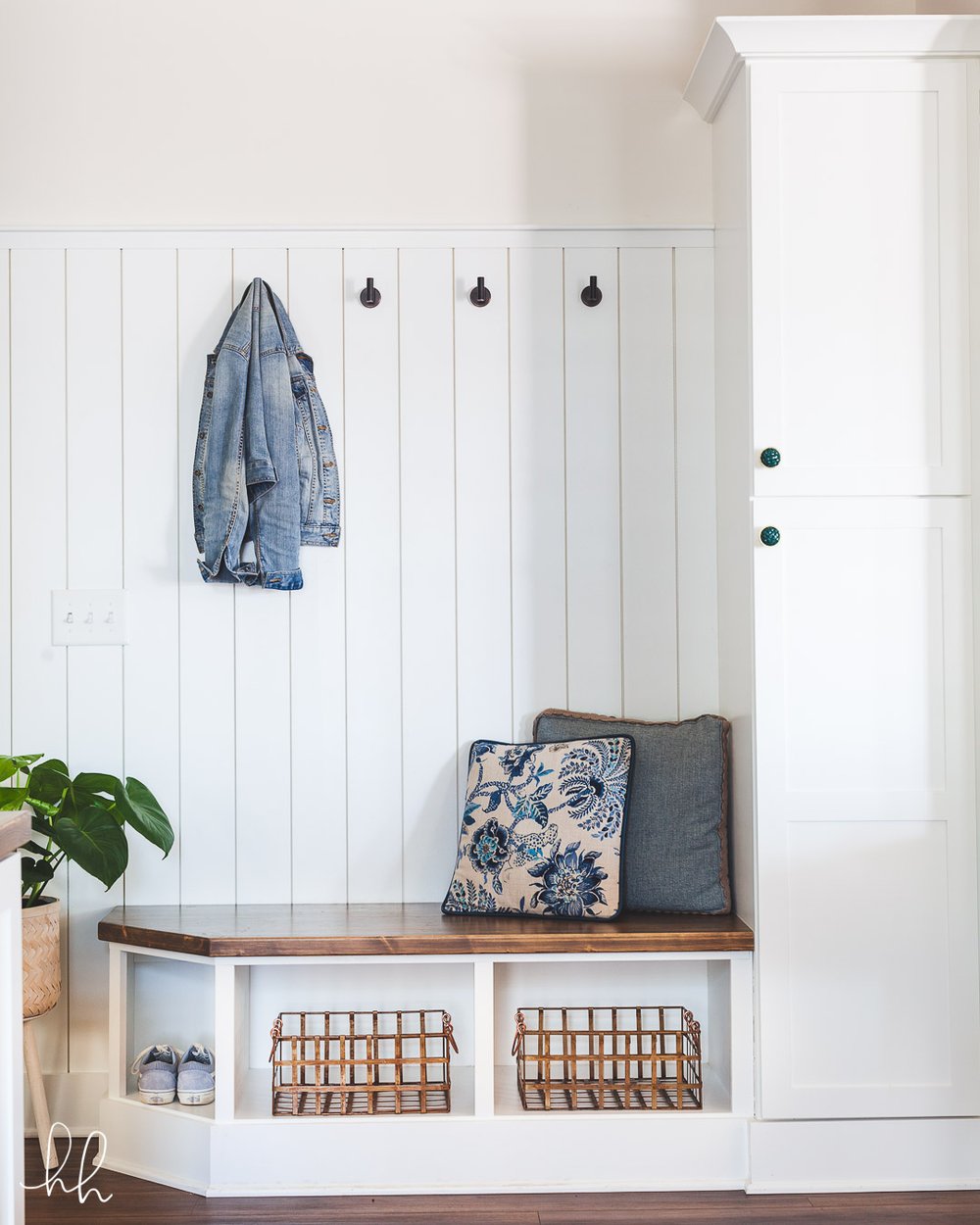
We always joke that wherever there was a blank wall we were like, “let’s put a bench on it!” because that’s basically what happened—below is our little drop zone that functions as a mudroom sort of situation. This is right by our garage door and has been so handy for putting on shoes, putting Gideon in the car seat, and dropping bags and coats on our way into the house. They added some additional storage to the right and finished it off with matching shiplap and some great hardware (the round leather knobs match the ones on our living room cabinets).
That’s all for now! I have another post coming up with some photos of a few bedrooms, and we are currently working on finishing up Rob’s office, so I’ll share that once it’s done. After renting for so long (often from really bad landlords), it is such a pleasure (and a privilege) to be in our own place and be able to make it feel exactly the way we want it to feel. Thanks for stopping by!
Design by Wright Design Co | Photos by Harmonie House Images


